MathWorks

Sponsored Project
Mixed-Methods Research • Usability Testing
How might we streamline the MATLAB assignment creation process for college lab instructors?
The Challenge
Overview
MATLAB is a programming platform developed by MathWorks. College lab instructors frequently create MATLAB assignments for their students, however the process is time-consuming and complicated. For this client project, I collaborated with a cross-functional team to drive user research and design strategy of a digital assignment marketplace and in-app point system, where lab instructors can publish, browse, and purchase other assignments to facilitate MATLAB assignment creation.
My Role
Lead UX Researcher
The Team
2 Product Designers
2 UX Researchers
Timeline
August - December 2023
Research Methods
Cognitive Walkthrough
Comparative Analysis
Concept Testing
Contextual Inquiry
Heuristic Evaluation
Interviews
Task Analysis
Usability Testing
Tools
Figma
FigJam
Maze
Notion
Procreate
Zoom
My Work
01
Led a foundational research plan of 5 user interviews, 2 contextual inquiries, 2 task analyses, and 1 comparative analysis to guide design direction of 3 key user flows.
02
Analyzed 300+ qualitative findings through affinity mapping and derived 3 key design implications for a high-fidelity prototype.
03
Facilitated 4 task-based usability tests that resulted in a 100% task success rate, and showed that 75% of participants found the final design intuitive to use.
Client Brief
College lab instructors use multiple different platforms to create and grade MATLAB assignments. This is time-consuming and inefficient. We were therefore tasked to develop a platform to streamline the MATLAB assignment creation and grading process.
Research Approach
01
Foundational Research
5 User Interviews
2 Contextual Inquiries
2 Hierarchical Task Analyses
1 Comparative Analysis
02
Evaluative Research
2 Concept Testing Sessions
6 Task-Based Usability Tests
2 Cognitive Walkthroughs
1 Heuristic Evaluation
Foundational Research
Adopting a multi-pronged, qualitative research approach allowed for a thorough exploration of a complex problem space.
01
Semi-Structured
Interviews
By leveraging our existing network in Georgia Tech, 5 lab instructors were interviewed to provide a rich perspective of user needs and pain points.
02
Contextual
Inquiries
2 contextual inquiries were baked into the interviews to allow us to view the assignment creation process in context and first-hand.
03
Hierarchical Task Analyses
2 task analyses (1 for assignment creation, 1 for grading) allowed us to visually identify the steps in each process and identify new opportunities for improvement.
04
Comparative
Analysis
The comparison of existing competitors (MATLAB grader, Coassemble, Colab. Google, and zyBooks) showed us gaps in the market and provided inspiration for ideation.
Researching the Problem Space

Task Analysis of Assignment Creation: Brainstorming, Organizing, and Implementation of Information

Comparative Analysis: MATLAB Grader, Coassemble, Colab. Google, and zyBooks
The initial client brief was very broad in scope. To narrow the problem space, our research began with user interviews and contextual inquiries as that would provide a deep overview of pain points for both assignment creation and grading. Findings from these methods later provided the foundation for 2 task analyses. Finally, a comparative analysis of indirect competitors equipped our team with an understanding of the existing market.

Synthesizing Results
Analyzing findings with an affinity map revealed that assignment creation is a higher priority, as auto-grading solutions already exist. In line with the evidence, our team narrowed our focus to assignment creation only.
Key Findings
01
Brainstorming is the most difficult part of assignment creation.
Most lab instructors refer to other resources (e.g. colleagues, the Internet, textbooks) as it is difficult to generate new assignments without external inspiration.
02
Lab instructors struggle to pitch assignments at the right level to cater to all students.
Students have different academic abilities, and it is hard for lab instructors to strike the right balance of assignments that are challenging yet encouraging for all students.
03
Combining components from multiple sources is time-consuming and inefficient.
Lab instructors spend significant amounts of time sourcing components from various locations (e.g. images, recycled old code) to incorporate into their assignments.
Design Implication
01
The design should facilitate collaborative brainstorming and resource sharing.
“I look at problems in textbooks or online to come up with problems for students.”
- Participant 1
02
The design should allow for assignment categorization by difficulty to cater to different academic abilities.
“Finding a good problem that can teach something but is not overly complicated is hard.”
- Participant 4
03
The design should be a singular platform for users to access and incorporate components easily.
“I use components such as starter code and images to create assignments.”
- Participant 1
Summarizing the Problem
Creating MATLAB assignments is tough. It is hard to generate new assignment problems that challenge students and test concepts accurately, while accommodating for varying levels of academic ability. Furthermore, lab instructors utilize multiple sources to find relevant components and inspiration, which is time-consuming and inefficient.

Concept Testing
Based on initial feedback, we developed a digital assignment marketplace and in-app point system to facilitate brainstorming and creation of new MATLAB assignments.
To ensure design alignment, I presented key findings to the team and our client. As a team, we then began ideating, sketching, and storyboarding. These ideas were then evaluated during 2 concept testing sessions to determine their value and utility for users. They were conducted with the client, MathWorks and a UX expert in two separate moderated sessions.
Based on feedback from concept testing, our team iteratively developed a digital assignment marketplace for lab instructors to browse and purchase other instructors’ assignments. To ensure fresh platform content, an in-app point system rewards instructors with points each time they publish their own work. These points can later be used to purchase other assignments and serves to motivate engagement.
Usability Testing Round 1
Wireframe user testing revealed 3 key usability findings that informed the design of our high-fidelity prototype.
Task 1:
Publishing
Assignments
Task 2:
In-App
Point System
To evaluate the functionality and usability of our design, I tested our wireframes with 2 lab instructors from Georgia Tech. These lab instructors matched the profile of our target users and were recruited through our connections in Georgia Tech.
Task 3:
Purchasing
Assignments
Each session consisted of 3 task-based scenarios as shown above. Participants were instructed to think aloud and were asked short questions after each task about their understanding and their overall experience completing the task.
Finding
The in-app point system is unclear and confusing.

Although both participants liked the concept and felt that it would motivate them to contribute, both expressed initial confusion as they did not understand how to earn, spend, and check on their points.
Finding
P2: “I didn’t even notice the reward system”
An onboarding flow to provide explanation.
Solution

To help users better understand the in-app point system, we designed an onboarding flow to explain how to earn points, what they are used for, and how to locate your current point balance.
Solution
The assignment preview is insufficient for users to decide if they should proceed with purchase.
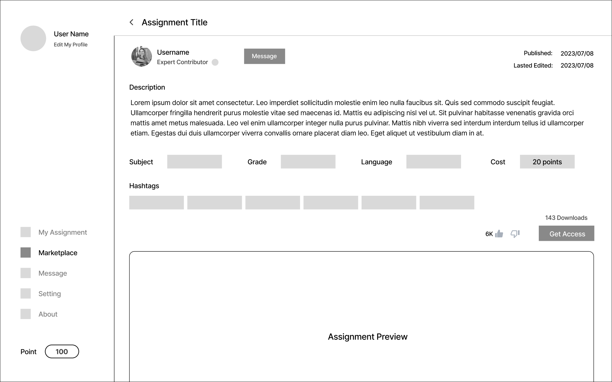
Both participants felt that the assignment preview lacked necessary details for them to decide whether to purchase the assignment. Participants wanted specific information to assess the quality of the assignment, such as a ratings or review system.
Finding
P1: “You have to make sure you will get what you want to get before spending the points”
Adding reviews, grade statistics, and a full preview enable users to make an informed choice.

To empower our users’ decision making, we added questions, reviews, and student grade statistics so that users are more informed before they purchase any assignment. Additionally, users can view the full assignment with watermark in JPEG format. This allows them to view but not copy or edit the assignment. Users only receive a PDF copy upon purchase, which they can later edit for their own use.
Solution
Buttons and text were not clearly visible.

Participant 2 struggled to find the cost of the assignment as the button and text were too small in size and too light in color.
P2: “The font is too small, too light”
Using color to increase emphasis and visibility.
To increase the visual emphasis of the cost of the assignment, we added a blue border and icon to the points. We ensured that the colors used had significant contrast and satisfied the WCAG Level AAA.
Expert and Usability Testing Round 2
The final prototype was tested by both experts and users to identify any outstanding usability and learnability issues.
First Phase
Expert Testing
Our evaluation began with expert testing to first identify any major usability or learnability issues to address before testing with actual users. Individuals were considered experts if they had existing expertise in User Experience (UX), and were recruited through convenience sampling from our Georgia Tech network.
Through the cognitive walkthrough, our team found that new users may find it challenging to use the prototype due to the large amount of information available. From the heuristic evaluation, our team found that the amount of information was adequate, however, there needed to be more visual hierarchy to distinguish the relative importance of information.
Based on feedback from the UX experts, we updated our prototype. We subsequently moved onto user testing with 4 Georgia Tech lab professors. Each user testing session consisted of 2 task-based scenarios, followed by a post session interview. Metrics measured included task success, efficiency, and self-reported metrics of difficulty.
In addition to usability, this method aimed to evaluate the overall functionality of the prototype and to assess how well it addressed the pain point of difficulty in assignment brainstorming.
Second Phase
User Testing
2 Cognitive
Walkthroughs
2 UX experts evaluated the learnability of the prototype, especially as the in-app point system may be novel and confusing for users.
1 Heuristic
Evaluation
1 UX expert assessed the usability of the prototype by grading each aspect according to Jakob Nielsen’s 10 usability heuristics.
4 Task-Based
Usability Sessions
4 Georgia Tech lab professors tested the usability of the prototype by each completing 2 tasks: publishing assignments and purchasing assignments.
4 Post Session
Interviews
To evaluate perceived value of the prototype, the 4 lab professors were asked about their thoughts and experience of using the prototype.
Key Findings Round 2
100%
Task Success Rate for both key flows.
3 out of 4
…participants described the final prototype as intuitive.
On average, participants rated difficulty in the two tasks as
1.75 & 1.375
out of 5 (where 5 is the most difficult).
Overall, participants had a clear understanding of the functionality of the prototype and appreciated the concept. However, participants expressed concerns of students gaining access to the platform, thus security features such as multi-factor authentication should be explored.
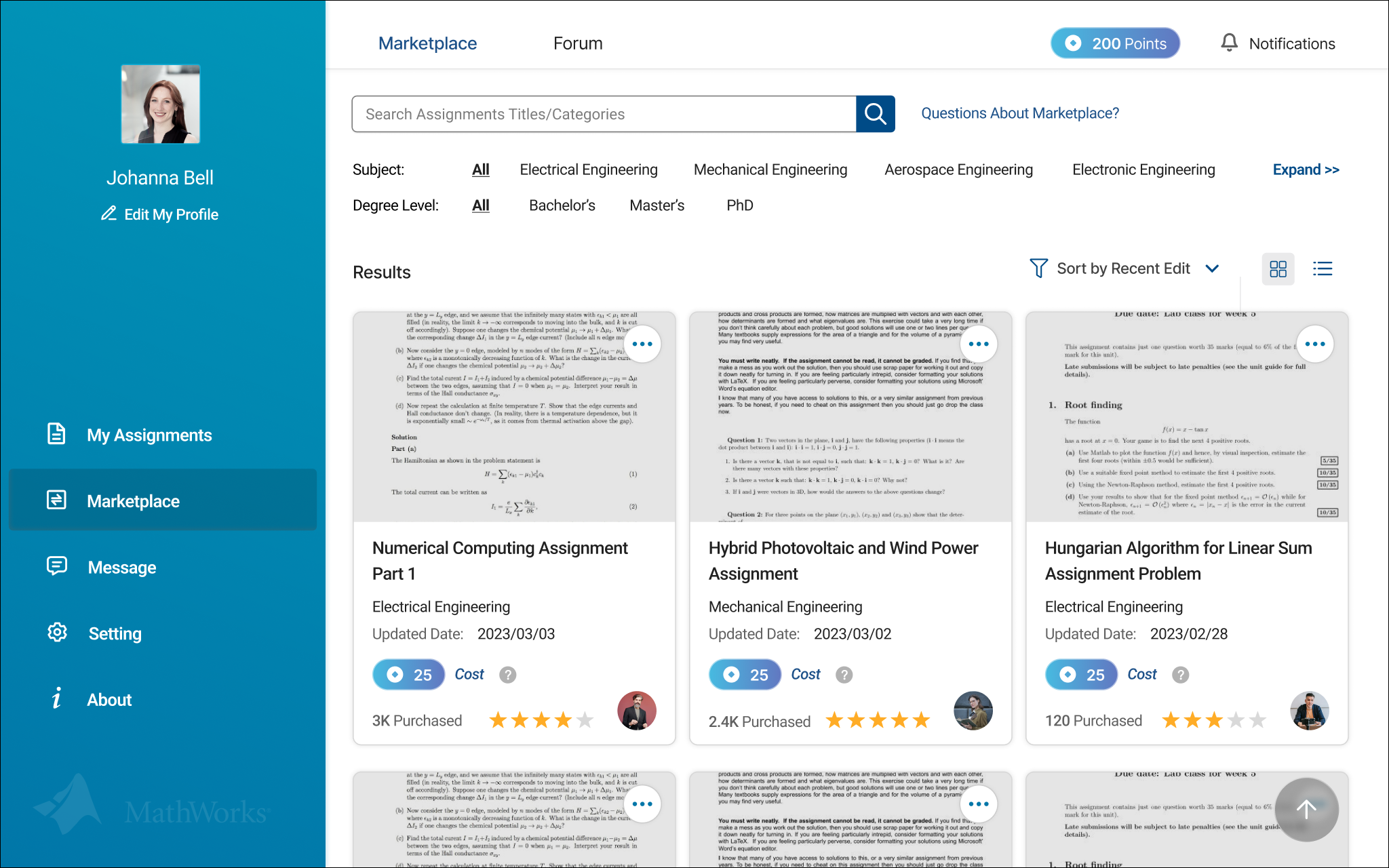
The Final Prototype Features
A digital assignment marketplace and in-app point system that aids and promotes MATLAB assignment creation for lab instructors.
01
Publishing assignments to the marketplace

Users fill in relevant details and publish their own assignments to the marketplace. By doing so, users earn in-app points, which can later be used to purchase other users’ assignments. Additionally, users have access to their personal repository of previously created and purchased assignments.
02
Onboarding flow for the in-app point system

When users first enter the marketplace, they encounter an onboarding flow to learn about the in-app point system, including how to spend their points and where to find their point balance.
03
Purchasing assignments from the marketplace
Users can browse the marketplace to purchase other users’ assignments. Before purchase, they can review assignment ratings, student grade statistics, and also preview the entire assignment in JPEG format.
Final Thoughts
Human-centered, evidence-based design effectively tackles pain points.
During this project, I was reminded of the importance of human-centered design. As we went through the design process, we realized that we had deviated from the initial client directive, which was more specifically to develop a graphical user interface (GUI) for MATLAB assignment creation and grading.
Despite this, our final prototype was a more direct solution to addressing the main user pain points. This is validated in the fact that one lab professor even asked us to keep working on it and develop it into an actual real-life product! In future, I would love the opportunity to continue this work and iterate on the user feedback as above.